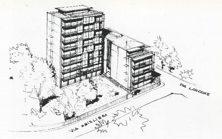
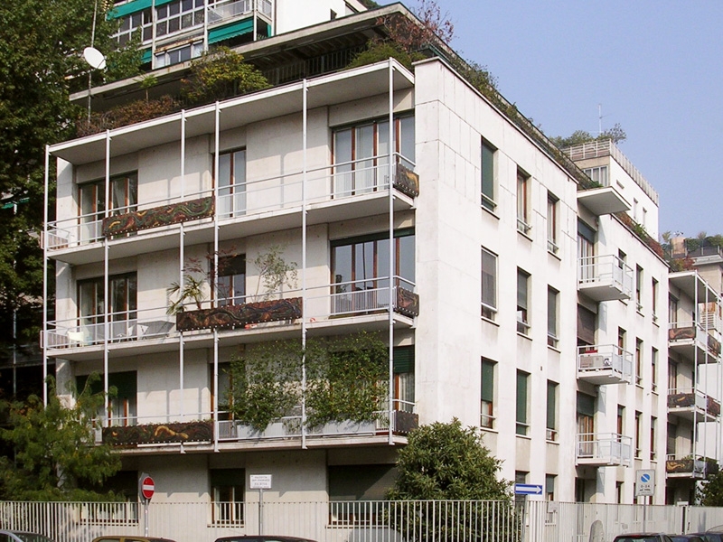
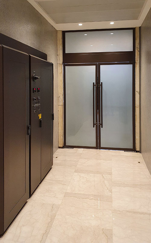
Apartament building via Lanzone 6 Milan
Vito and Gustavo Latis, 1949/52
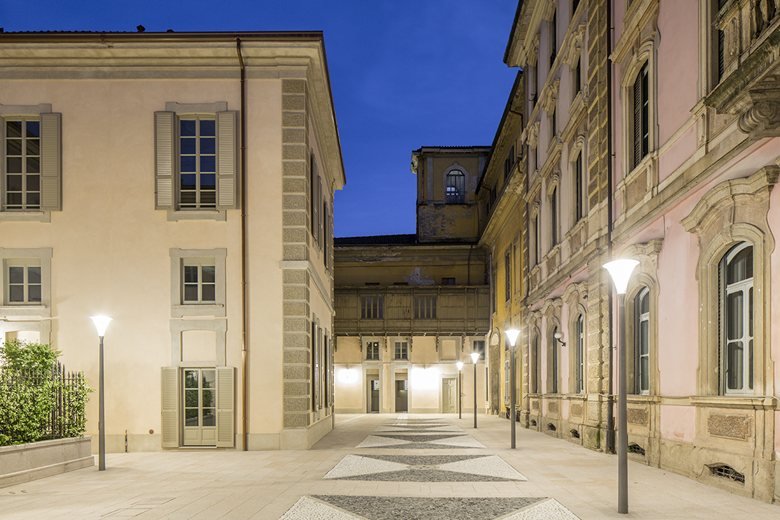
u003ch6u003eResidenze Litta, Milanou003c/h6u003e
Does it often happen to you to refit existing environments?
Yes definitely. In Italy, then, there is more propensity to save and recover than to demolish and rebuild and this is positive. In my profession, it has happened to me several times, to intervene on the existing and, of course, when dealing with historic buildings with a strong symbolic value it is even more fascinating. Bringing back the original beauty is a challenging and very exciting experience. I was lucky enough to work in beautiful contexts such as the Franco Parenti Theatre and the Mysterious Baths, the Litta Residences in Milan and the Cini Foundation in Venice. All incredible opportunities to decline contemporary needs with structures, volumes and aesthetics, which are the heritage of our past and our future. .
And when there is no historical value?
Always in favour of saving rather than demolishing?
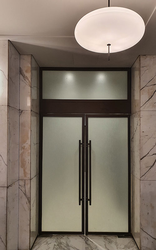
With due distinctions, I would say yes. In everything, if you look carefully, you can find good, but it also takes the courage to highlight it by eliminating the many useless layers that often cover it. Recently, for example, we had to intervene in the atrium of a large 18-floors office building, where the reception on the ground floor was horribly caged in a very heavy glass and metal structure and the floor in huge slabs of calacatta marble covered with carpet.
The furniture parts were decorated with fake leather, perhaps a legacy of the late 1980s and the whole thing was so overloaded that the temptation to demolish everything, I confess, came to me. The urgency imposed by the Covid emergency, and the allocated budget, however, did not suggest a massive restyling, but rather required a quick refitting, easily implemented and so it was decided to evaluate a series of small targeted, almost surgical interventions, to give space back to right aesthetic and functional value.
We started by removing everything that was no longer needed. Very often, over the years, interventions with different purposes overlap, also implemented by different professionals, with different styles and approaches, so in reality, like the archaeologists who carefully remove the sand and bring to light priceless treasures, we too must often remove these superfluous layers, trying to find an original identity or in any case to create a new, valid and clearly understandable one.
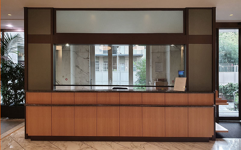
u003ch6u003ePalazzo Uffici via Pirelli, Milanou003c/h6u003e
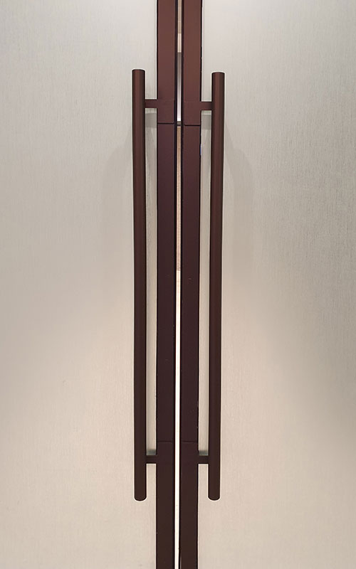
The ductility of these solutions has also made it possible to intervene on parts that I did not initially consider, such as handles and electrical panels, too intrusive presences in a space intended to accommodate. We thus camouflaged them, decorating them with the same bronzed finish as the frames, incredibly improving their visual impact. After the restyling of the more "hardware" parts, we began to think about how this space should communicate with all its inhabitants, who would cross the lobby every day to reach the offices. Among other things, Covid prescriptions were an important part of this communication and so we tried to transform this communicative need into an opportunity for visual communication, giving a new and useful identity to the space and adding delicate and discreet signage made on measure.
How did you propose this refitting approach, all in all innovative, to the client?
To tell the truth, one of the aspects I love most in my work and in the relationship I have with my clients, is the relationship of mutual trust that is created and which must be nurtured every day. Proposing "tailor-made" solutions, not only for the customer, but also for his needs of the moment is a sign of sensitivity that pays in the long run. I am not one of those architects who want to impose their own style at all costs, rather I like to decline my proposal - which obviously has a stylistic trace and common threads -adapting it to the expressed and unexpressed characteristics and needs of those who ask for my design support.
In this specific case, the alternative to refitting would have been a much heavier and more expensive intervention but it was an impossible way, with unreasonable costs and timing. We had no other solutions and this was certainly a decisive lever in trying to use films. However, I myself did not imagine that the result would be so convincing. As with many of my colleagues, the idea of using "fake" materials appears to be a culture-free approach. After twenty years with Michele De Lucchi, then, a real act of insubordination! But on closer consideration I assessed that the test was necessary: the final balance between costs, times and results could not have been obtained in any other better way.
What I am interested in communicating is that these solutions, used consciously, bring with them an intrinsic sustainability: it is true that PVC films are used, but thanks to these finishes, many things are given new life (structures, curtain walls and furnishings) that otherwise they would have to be disassembled, disposed of and replaced with other elements that must be produced, transported with all that derives from them. In the end, if the organisation of the space is already functional, the fact of radically changing its personality simply by working on the finish, on site, is completely revolutionary.
Will you use these solutions on other occasions? Certainly yes, and indeed today I am more aware of how the surface of the film can be approached and "confused" with real materials, in a mix between real and fake that at the same time increases the quality, duration and expressive capabilities of the product. I think it is very important today to try to think in terms of entropy, to reduce the impact of the construction site as much as possible: confusion, production, waste ... these light interventions, almost make-up, can solve solutions that have a short-time expectation and which for this reason would not justify a more important and costly intervention.
The restyling of this hall and its reception took about a week and due to its quiet and clean construction method, it did not interfere with the people who still had to access the offices. We had an urgent need to intervene well and quickly and it did. Indeed, the installation was so fast, that paradoxically the design phase lasted longer than the executive one.

