Progetto CMR, a design company founded by Massimo Roj in 1994, is today one of the most successful companies in the integrated design sector and one of the 100 largest architecture firm in the world. Inside, various skills are articulated, ranging from architecture to urban planning, from space planning to interior and product design. From this multi-disciplinary DNA, IMAGING is born: a new division for physical branding, which further enriches the know-how of this design giant. We met them virtually and we were told their point of view.

What does physical branding mean to you? In every architectural project, at a certain point, we arrive at the interior design step, in which on the one hand there is the study of the furnishing elements and on the other the graphics and signage which, depending on the context, can be more commercial or functional. Since a while these two aspects have begun to interact with each other requiring planning attention and cultural sensitivity.
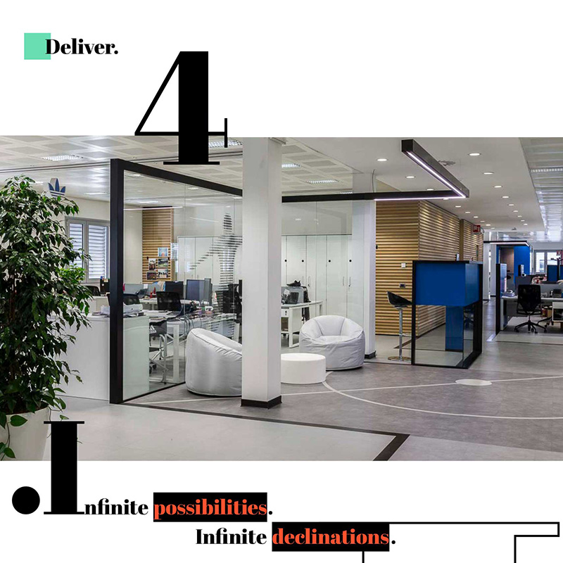
If in the 90s declining the brand in space basically meant using "corporate colours" for furnishing elements or, at most, for some partitions, today these colours have evolved into graphic forms with strong evocative and narrative power, becoming themselves, pieces of furniture.

Does the IMAGING team also have technical expertise or do you refer to the know-how of those who then support you in the executive phase? Creativity certainly comes from an abacus of standard solutions: we know the products by macro categories. We know that some films are coloured during production and are therefore more resistant to sunlight; others dedicated to printing and/or e-cut and can be used for opaque and transparent surfaces. We know the collections that replicate woods or metals and are perfect for creating large material surfaces. For further technical issues we rely on the contractor, who plays an important role for us in this new approach to interior design. It is the craftsman who brings the specific expertise of materials and possible applications and together we compare ourselves to experiment and find new solutions.
How did you choose the profile of professionals to be included in this new division? This evolution required a more complex work team, with different expertises and backgrounds. Graphic designers and artists work alongside interior designers, as the artistic aspect must confront the environmental aspect and for this reason the exchange between those accustomed to two dimensions (graphic designer) and those who have the volumetric perception of the three dimensions (architects and interior designers) is fundamental. The team is made up of more design figures and others more technical: if the declination of graphics as a decorative and environmental element requires a more artistic component; the executive part requires more specific graphic skills, supported in the application by external contractors.
Does it occured more often to intervene on the new or on the existing? Up to now IMAGING has lent its know-how more frequently to the new, where this physical branding contribution is born together with the architectural project, creating an interesting coherence, but being able to intervene also on the existing is a goal to which we look with great interest. Beyond the visual impact, which remains the fundamental component of environmental graphics, the economic aspect is also an important lever in making this approach successful. IMAGING as a division of Progetto CMR, faces a market segment of very large works, where the budget is always a challenging component. Traditional solutions, such as the use of boiserie, are more economically demanding and require application on all surfaces (to create the boiserie effect). The environmental graphics, on the other hand, allow to characterize an interior by intervening even partially, on a single wall, offering greater flexibility and therefore an important advantage.
Especially in the retail world, where this decorative-communicative approach is more advanced, there is often a tendency to choose materials and colors based on current fashion. IMAGING, on the other hand, focuses its attention on the identity of the project without being distracted by the trends of the moment: reflecting carefully on the real needs of the spaces and the client is a distinctive feature of the whole team.

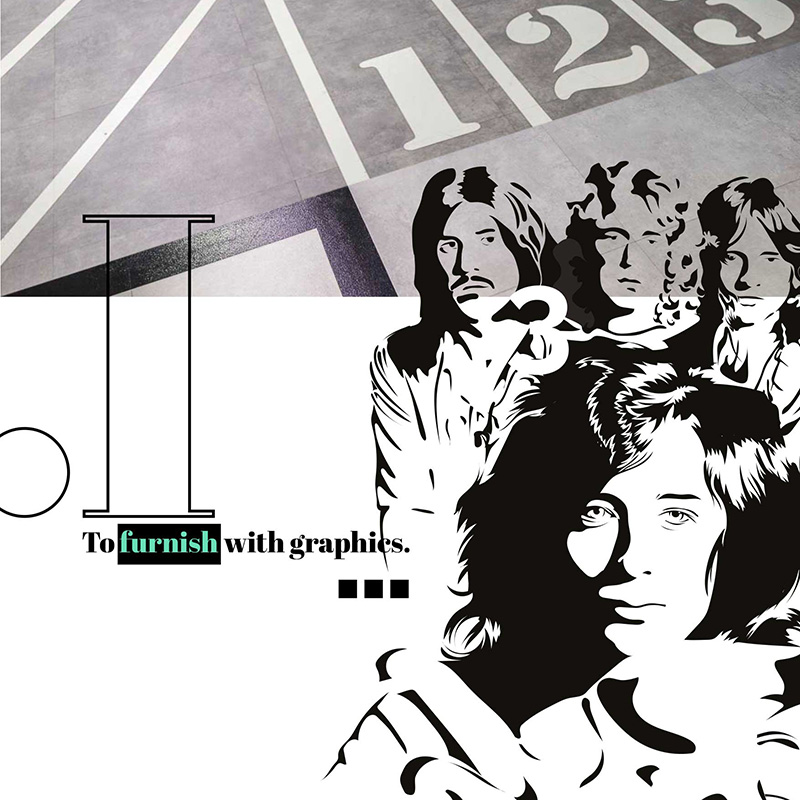
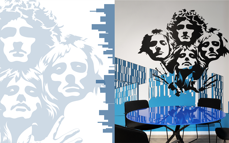
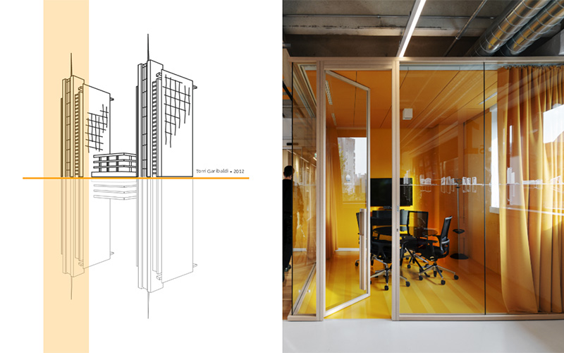
Where do you find inspiration? In some cases, as the for Adidas project, the promotional aspect is the one to build the decorative project around, in other cases, as for Huawei, from an original idea, the skylines, we create a leitmotiv with which to characterize the countless offices. When it is possible, and it is the solution that we are most passionate about, the graphic/decorative project blend with the architectural project, as happened in our headquarter in Milan, that has become our manifesto. Playing at home allowed to experiment and have fun with multiple languages, while maintaining a coherent concept, that is, the story of the studio through the projects. The narration became more technical, on the glass walls, more graphic on the walls and more artistic in the meeting rooms, where Massimo Roj's passion for rock inspired the “pop-art” graphics. Our headquarter represents the best promotional tool: colleagues and customers, who see this kaleidoscope of messages and contents, often ask us to replicate it in their spaces.
Do you consider yourself more artists or designers? A perfect combination of the two. Each project is unique, because every sites has its own different identity and physiognomy and, as mentioned, the physical branding must decline these two components. The result must be a graphic and chromatic transposition of the corporate identity in a way that is consistent with the interior design. Our aim is to enrich the perception of the brand with a new physicality, where color, combined with the graphic sign, becomes a didactic and emotional message.
Artists or designers, for sure the IMAGING team, which is not even a year old, has its roots in a long and profitable design experience. This year we created the website and social profiles on which various projects are published.
After twenty years of total white and a pandemic that has eliminated interpersonal relationships, all environments, leisure or work, must rediscover themselves welcoming and engaging: environmental graphics is certainly a good way to do this.


